Did you know color combinations can make or break a design? Usually colors emphasize an atmosphere or a feeling. For example think of red as danger or as passion and warmth. It can therefore enhance the message you want to communicate.
However not all colors are a good combination, especially for text. When a bad color combo is used, it can actually bring the effect of your design down. Even though it looks very cool and you have printed it on a 2 by 4 meter billboard banner. For example: red letters on a black background, or purple on red are very hard to read, even more so for colorblind people. And no matter the size, a design will lose it’s message when it’s not readable. Something you definitely do not want as a designer.
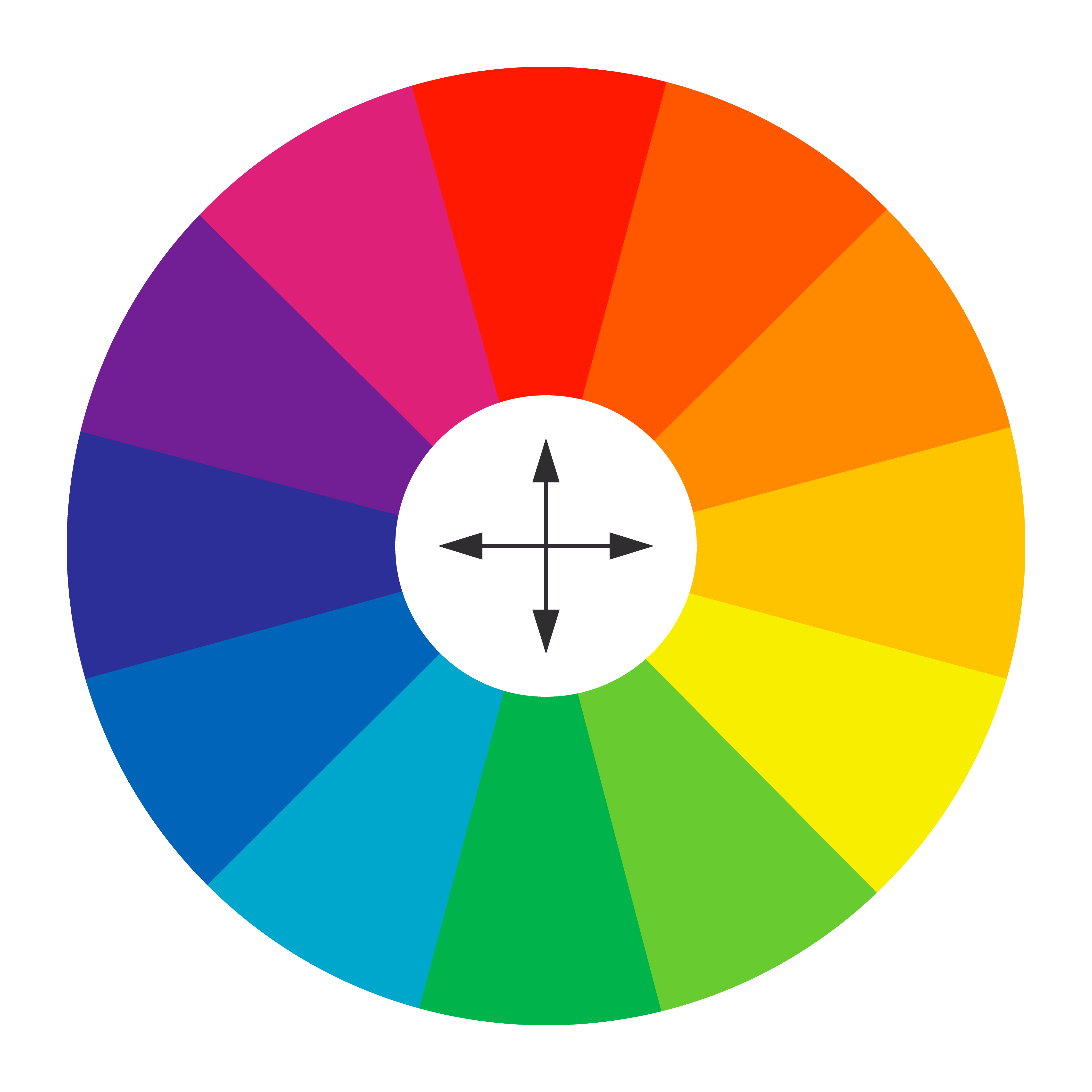
Colors that do work good together are called Complimentary (but of course!) Colors and are basically found opposite of each other on the color wheel. They bring out the best of each other and when used in a good way, they can even make a design look like it is giving light and bring it to life. This enhances the readability of a design in the distance and that’s basically what we all want, right?
So that’s exactly we try to achieve every time we design: making sure it brings out the message from every distance while still looking cool. Besides that, we always try to keep the clients wishes in first place, but if we know a color combination is not working, we will show why and alternatives.
Do you pay attention to color combinations in design (advertisement or posters for example) or never really thought about it consciously? Let us know in the comments below!